House2Home Banner April 2020.png

Role

I performed this sprint solo.

Tools

Figma, Photoshop

Timeline

5 days


Overview

In this case study, I solved a design challenge from BiteSizeUX by completing a modified Google Venture (GV) sprint.

Problem statement

House2Home is an e-commerce startup that wants to make it easier for people decorate their new homes and apartments on a budget. Surveys have revealed that many of their customers have just moved in to a new home or apartment. These users want to buy multiple items to personalize their new place, but they don’t feel confident doing it on their own.

In this design sprint, I helped House2Home explore solutions to helping their customers easily find items to decorate their new place.

Provided user research

(Quotes from the provided research, including 1 persona & 1 user interview)

  • Apartment looks “so empty”

  • Hard trying to style on a budget

  • Overwhelmed

  • “I see cool little items but I never know if they'll all look good in the same room.”

  • “...will they look good in my room? You don’t really know until you try them.”

  • “I know the ‘look’ I want, and how I want to feel when I walk in.”

  • Move a lot so don’t want to invest

  • Unsure what will work for them

  • Unsure how to achieve a certain look, especially without buying tons of items and on a budget

Process

day one

Tan Banner Thinnest.png

Start at the end

Per GV’s design sprint guidance, I started the sprint by defining the long term goal for the product and crafting questions for the sprint to answer. On Day One, I was considering using a renting or subscription model, which is reflected in the questions and map below.

Long term goal

House2Home becomes the leading e-commerce solution for purchasing or renting home decor for 18-35 year old people.

How could we fail?

  • Select the wrong rental or subscription model.

  • Fail to provide enough style choices that appeal to users.

  • Fail to provide enough perceived value in the items for the budget.

Questions for the spring to answer

  • How can we provide styling guidance so users don’t abandon their carts?

  • How can we allow for users to try different types of styles and items?

Map

Next I drew a map of a possible end-to-end experience a user might have with the product.


I ended day one with writing “How Might We” questions to guide tomorrow’s brainstorming.

How might we?

  1. How might we make the process of selecting home decor less overwhelming?

  2. How might we allow users to try different styles and combinations in their own homes with little to no risk?

  3. How might we help users achieve a full style with a limited budget?

  4. How might we guide people through home decor selection and styling for their unique space?


day two

Tan Banner Thinnest.png

On Day Two, I was focused on sketching solutions & making some design decisions. I started with a Lightning Round exercise followed by brainstorming a variety of ideas using the Crazy 8s method.

Lightning round


Crazy 8s


Decision

I decided to go with a mobile app that would allow for virtual styling of a user’s room. This solution addresses two of the major pain points (below) at zero cost and zero inconvenience to the user. The app would suggest curated home decor collections which have been created by professional interior designers. The professional curation would alleviate some users’ concerns that they don’t know which home decor items look well together. The virtual styling of curated collections will differentiate House2Home from standard e-commerce home decor sites and provide users an incentive to purchase from them.

Pain points addressed

  1. How will it look in my room?

  2. I don’t know what looks good together or how to achieve a certain look within my budget.

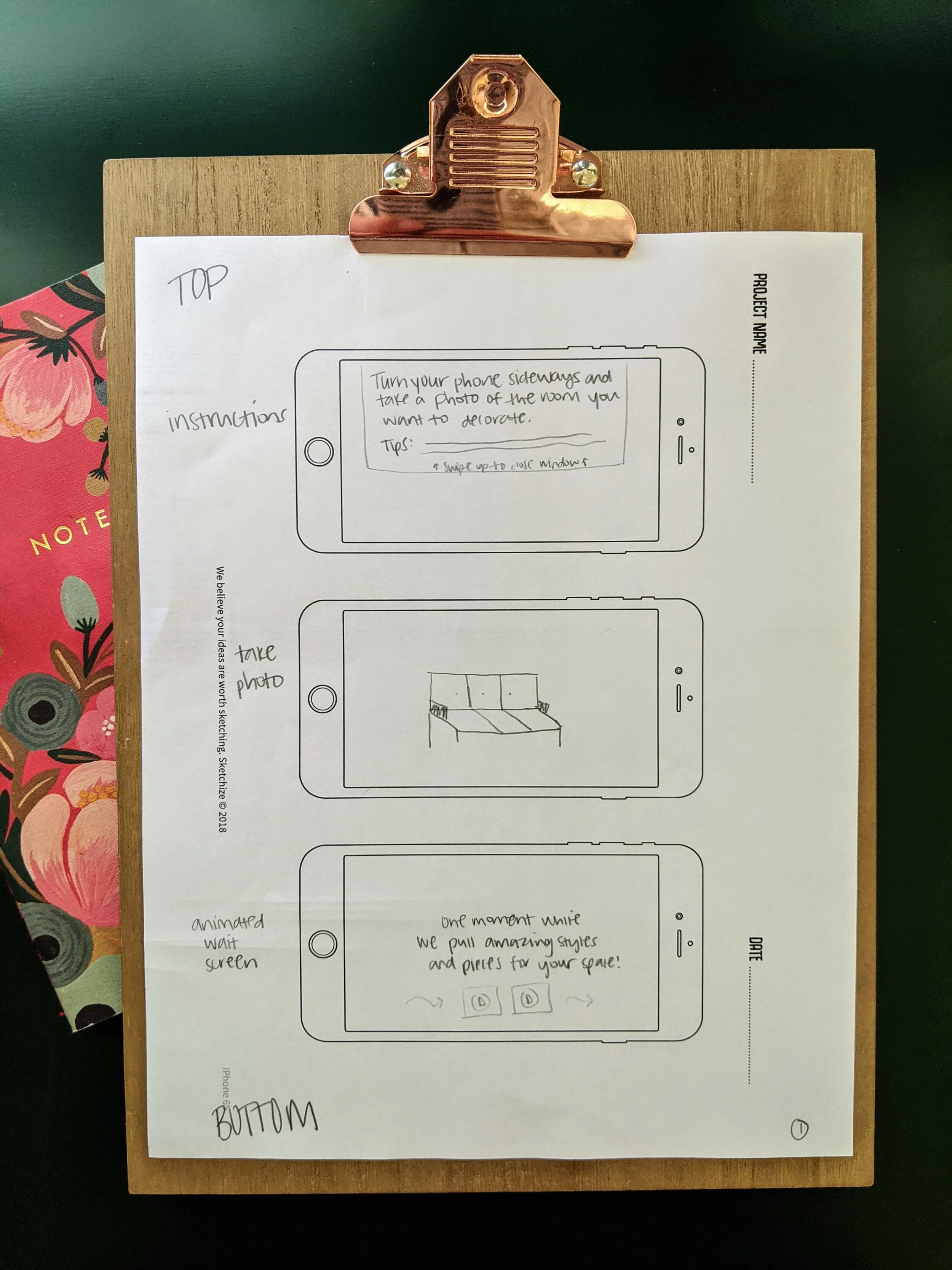
Three panel sketch

To end Day Two, I created a three-panel storyboard depicting the most critical screen the user would interact with and the screens directly before and after it.


day three

Tan Banner Thinnest.png

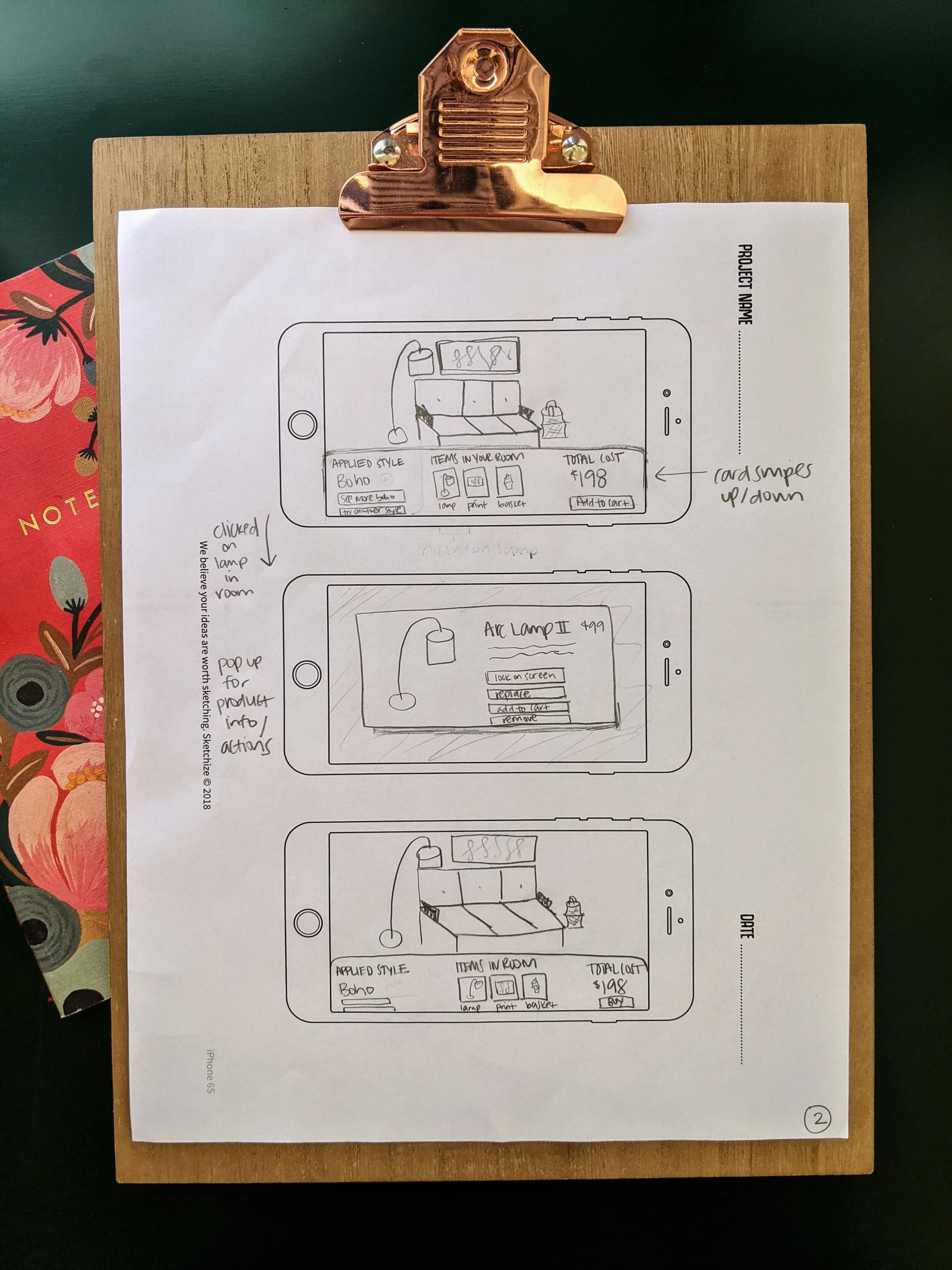
On Day 3, I sketched the red route of the virtual styling workflow of House2Home’s mobile application. Some of the key design decisions I made are outlined below.


Horizontal layout

Though a horizontal layout is unconventional for a mobile app, this layout is optimal for taking a usable photograph of a room and styling it.

Slide out menu for thumb zone

The original sketches show a long horizontal menu at the bottom of the screen. I changed this to a slide out menu from the right side of the screen, which will be in most people’s thumb zone.

Movable objects

This interactive element is a delightful feature that also helps users visualize how items will look in their home. Ideally, the AI of the app will place items in an appropriate place (ex: a print will be centered on a wall) but if not, the user can manipulate the placing of objects by dragging the item with their finger to another position.

Trash can on screen

The ability to drag an item to the trash can icon should be fairly intuitive.


day Four

Tan Banner Thinnest.png

Day Four was long, but exciting! I opted to work in Figma because I knew their “smart animate” prototyping features would allow me to create a fairly realistic “drag and drop” functionality. 

I made quick decisions about the visual design and UI and made a prototype with some items that could be dragged and dropped into place with a user’s finger.


day Five

Tan Banner Thinnest.png

Testing

On Day Five, I tested with the 5 people I had recruited earlier in the week. I completed these tests both in person and remotely. I followed the “5 Acts” testing strategy described by GV Sprint. 

I asked users to walk through a simple workflow:

  1. Complete onboarding screens

  2. Rearrange (and remove) a few home decor items when the first style was applied

  3. Switch to another style 

  4. Add one home decor item to the shopping cart.

Usability test results

I recorded notes throughout each testing session and compiled a test report afterwards. 

Positive feedback

  • “I like the ‘let’s do this!’ on the button. It sounds like ‘we’ll do this together.’ It seems friendly.”

  • “I like that it’s easy to remove something using the trash can.”

  • “It’s nice to be able to move the items.”

  • “I like moving the items around.”

  • “Great idea. I would use this!”

  • “I would definitely use this.”

Issues report

Next steps

My sprint ended here, but if I were to continue designing this app, some of the high priority items I would address are:

  1. Add a 360 degree view of products.

  2. Add the ability to drag an item from the menu into the prototype.

  3. Change or remove the onboarding tips.