Overview

In this case study, I selected a problem to investigate as part of a student project for a UX design bootcamp. I’m very interested in the impact of technology on the air travel industry so I opted to tackle an issue in this area.

Problem space

Let’s be honest. Even in a “mobile first” world, some things are just easier to do on a computer. One of these things seems to be booking flights. I wanted to explore why many consumers abandon their mobile phones when it comes to booking air travel.

I was also interested in learning about users’ attitudes towards chatbots and exploring the possibility of using chatbots throughout the flight search process.

My goal was to design a mobile solution that would encourage users to stick with mobile to search for and book flights.

Users & audience

I designed a consumer-facing application that can be used by anyone who is interested in searching for and booking flights.

Roles & constraints

I worked alone on this project as a UX student without a budget, which limited my ability to explore a wide range of solutions.

Tools

Adobe XD, InVision, Miro, Photoshop

Process

DISCOVER

Yellow green banner thinnest.png

Problem space

Study after study finds that users are claiming to be comfortable with booking flights on their mobile devices (1-5), but the majority of flights are still booked on a computer or via phone (6).

In order to design an improved mobile flight booking experience, I first needed to empathize with users and learn what their motivations, goals and pain points are when searching for and booking flights (both in general and on mobile). I started with crafting a research plan to ensure I had clear objectives to guide my research process.

Research plan

Objective

Identify opportunities to improve the flight search and booking process. Understand individuals’ attitudes towards using chatbots to assist in mobile booking processes. 

Research questions

  1. What pain points do people experience when searching for flights online?

  2. What pain points do people experience when booking flights online?

  3. What is most important to people when searching for and booking flights on a mobile device?

  4. What are travelers’ attitudes towards using chatbots during the flight search and booking process?

Methodologies

  • Screener survey to identify participants.

  • User interviews (5) to gain further insights into flight searching and booking.

Participants

  • Has booked a flight in the last 12 months

Market research

I combed credible travel industry sources and reports online, especially those completed by Phocuswright and SITA. I discovered that American and British travelers describe their top mobile flight booking pain points as

  • Too much information

  • Too much time

  • Varying prices

  • Lack of useful visuals (7)

I also read about the growing implementation of chatbots by airlines. As of 2019, SITA reported that over 25% of airlines have implemented chatbots and another 55% plan to implement them by 2021 (8). However, the most common tasks for chatbots are to direct passengers to FAQs and provide flight status information (9).

Competitive analysis

Next, I wanted to investigate the strengths and weaknesses of the leading flight booking apps. I varied the types of apps in the analysis, including airline apps, online travel agency apps and Google Flights (which is currently only available as a mobile or desktop site). 

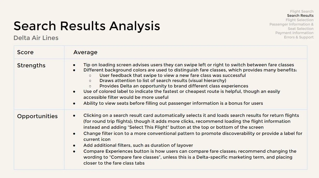
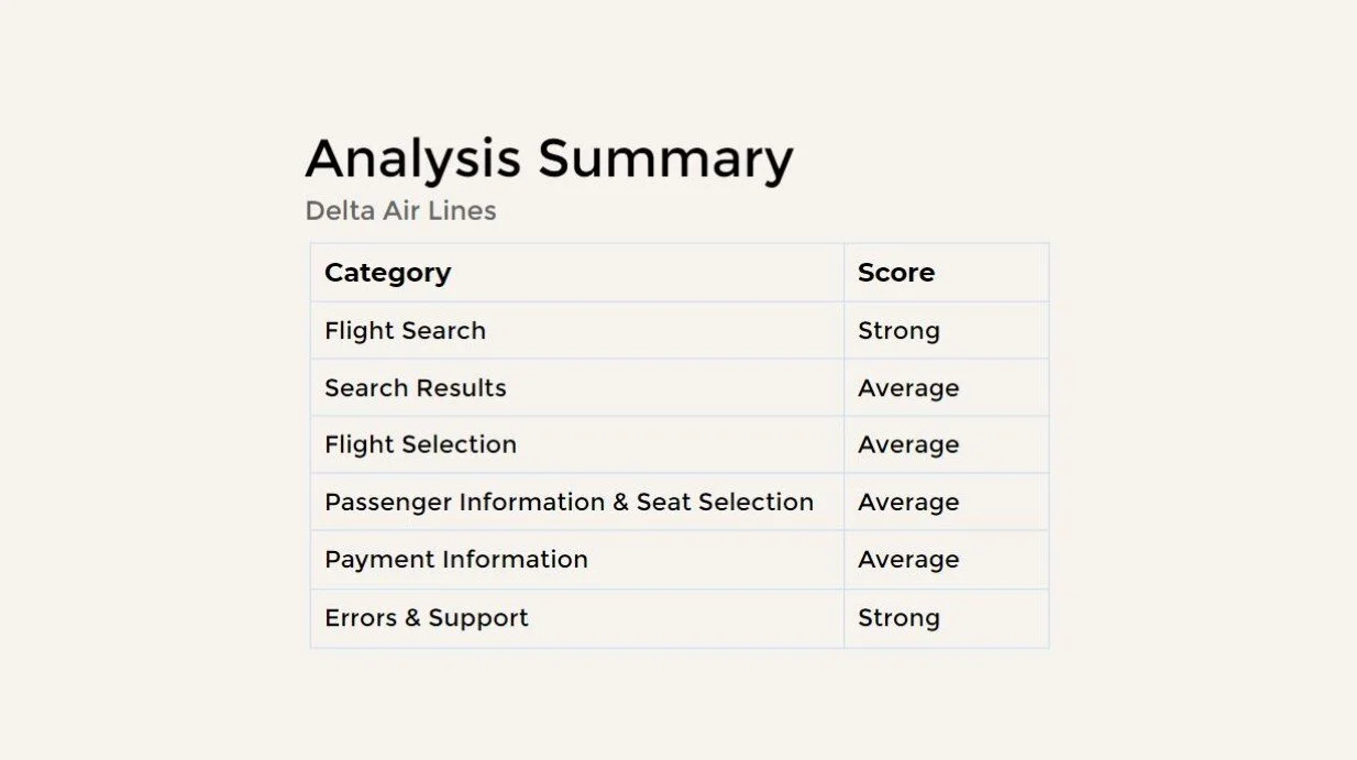
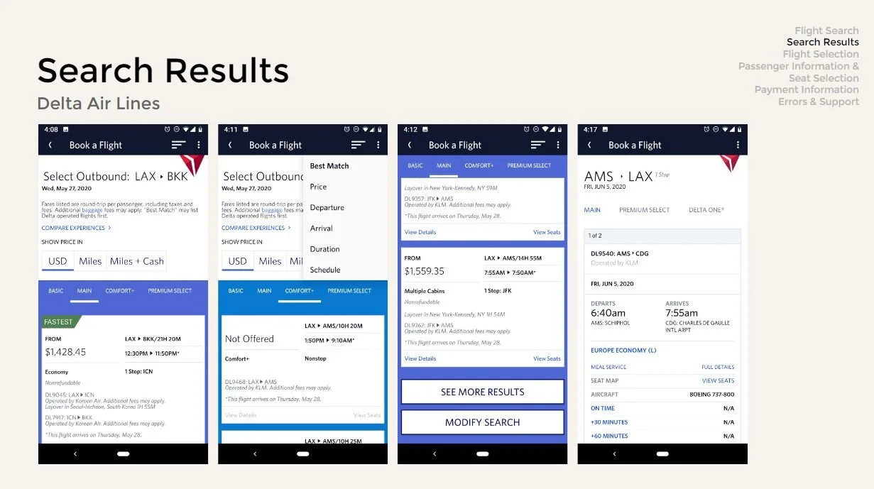
I dug deep into each step of the search and booking process, noting where apps excelled or could be improved. Some examples of my analysis are below. 

For a very detailed competitive analysis, click here.


Screener survey

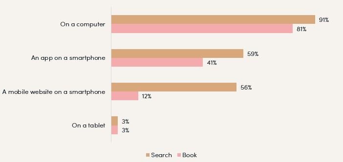
To ensure I would be connecting with people who had booked at least one flight in the last 12 months (and who may have experience with chatbots), I used a screener survey. This also allowed me to collect a bit more data about device use for air travel planning.

34 people completed my screen survey. The results were a reflection of the information I discovered during my secondary research.

While 90% of survey respondents shared that they had used a computer to search for a flight in the last 12 months, less than 60% had used their mobile device to do so (whether it was via an app or a mobile website). It gets worse from there; less than half used a mobile app to book the flight while only 13% used a mobile website to do so.

What device(s) did you use for searching & booking the flight?

Check all that apply.

No title.JPG

User interviews

Next, it was time to actually start talking with users (one of my favorite parts of the process). I developed an interview script to guide my conversation with the 7 people I selected for interviewing. I completed most of the interviews over Skype or on the phone, taking an audio recording of each and recording notes in a Google Sheets file. The script served as a guide, but I allowed the conversations to flow naturally.


Lighter Tan Banner.png

Define

Yellow green banner thinnest.png

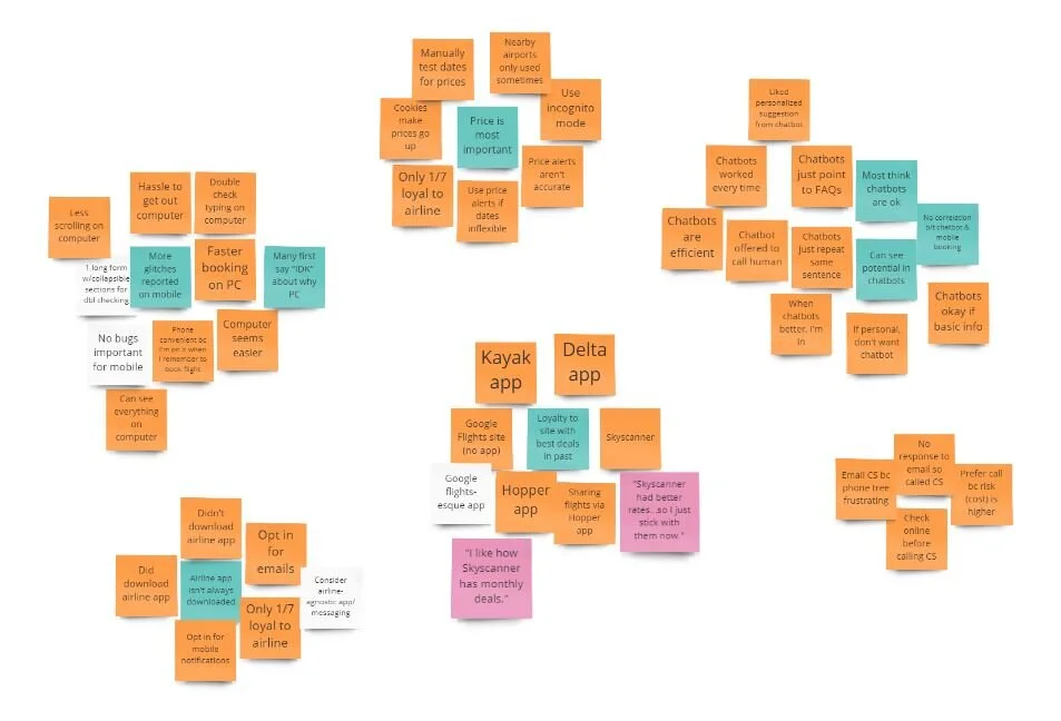
Affinity map

After the interviews, I “downloaded” my notes into a virtual affinity diagram in Miro.

Affinity Diagram.JPG
 
Affinity map legend.JPG


Pain points

Clustering similar comments and data revealed common pain points and other insights.


Other themes

  • Price is the most influential factor when searching for a flight

  • Users aren’t loyal to one airline

  • Users are loyal to sites where they had found good deals in the past

  • Some users perceived mobile sites and apps to be less technically reliable than desktop websites (more “buggy”)

  • Willing to do a quick search for flights on their mobile, but may turn to PC to book

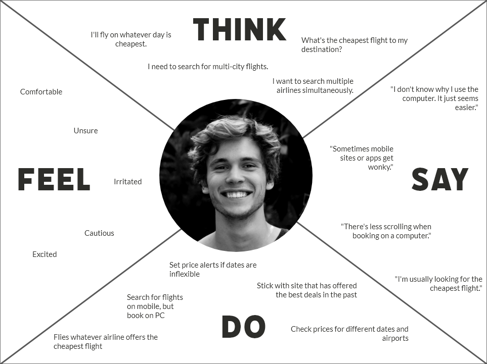
Empathy map

To continue synthesizing the research, I created an empathy map to capture the sentiments of the users I spoke with.

 
Empathy Map 1.png


User personas

I felt two types of users emerged from my research. Though both are concerned with finding good prices, there were differences in their motivations, goals and problems.


Problem statements & ideation guidance

To conclude the Define phase, I crafted two problem statements that emerged from the research and wrote three “How Might We” questions to guide ideation in the Design phase.


Problem Statements

  1. I want the cheapest (but not terribly inconvenient) flight to my destination.

  2. I want booking to be easy and not involve a lot of scrolling.

How Might We?

  1. How might we improve the flight search process?

  2. How might we help travelers find the best flight deals?

  3. How might we make booking on a mobile device more convenient?


DESIGN

Yellow green banner thinnest.png

Solution concept development

After reviewing the pain points and goals of users, I decided to forego exploring the use of chatbots for flight searching and instead focus on a purely mobile app design. This was partially due to a resource and time constraint as I was the sole designer on this student project.

At the time, I was still considering a price alert feature in my solution. I also considered creating “sticky” filters (filters which would apply to every future flight search session).

Before sketching solutions, it was important for me to understand the key uses, functionality and information architecture of the app. I worked through this by writing user stories, creating user flows and creating a site map.

User stories


User flows

(Note: My user flows reflect my initial idea of applying filters to the search results before viewing them, with the option to save them as “sticky” filters.)


Site map

Sketches & scope refinement

Before I began sketching, I reviewed my solution concept again with my mentor. We discussed the need (or lack thereof) for the “sticky” filter feature and the logistics of coding this.

Ultimately, we opted to forego the price alerts feature and sticky filters to focus solely on improving the flight search and booking process in a mobile app.

Then I created rough sketches for the app, some of which are below.


Wireframes

Finally, it was time to get into a design tool (Adobe XD) and start wireframing. The wireframing process allowed me to play with the design layout and flesh out the navigation and functionality of the app.

Earliest iterations

Round 1 testing

Once my wireframes were at a medium-high fidelity, I wanted to do a quick round of testing to gain some feedback. I first drafted a usability test plan to clarify my objectives, research questions and approach.

I started by working with 2 participants. I asked them to search for and book a round trip flight for 1 adult.

Wireframes used for testing


Red alert!

After only 2 tests, it became clear that my initial design of the checkout process was confusing. I originally planned for users to “add” a traveler to their account as they checked out that could be saved for later.

I decided to make the changes to the traveler and checkout process after only 2 tests. I feel confident that this was the right call because it allowed me to test the new process with more users.

Problematic checkout process

Round 1 usability report

I continued testing after changing the traveler information & checkout process. Fortunately, the new checkout process was a success! I also gained a lot of insight as to what was working and what needed improvement in other parts of the prototype.

 
Round 1B Testing - Tan background no title.JPG


UI exploration

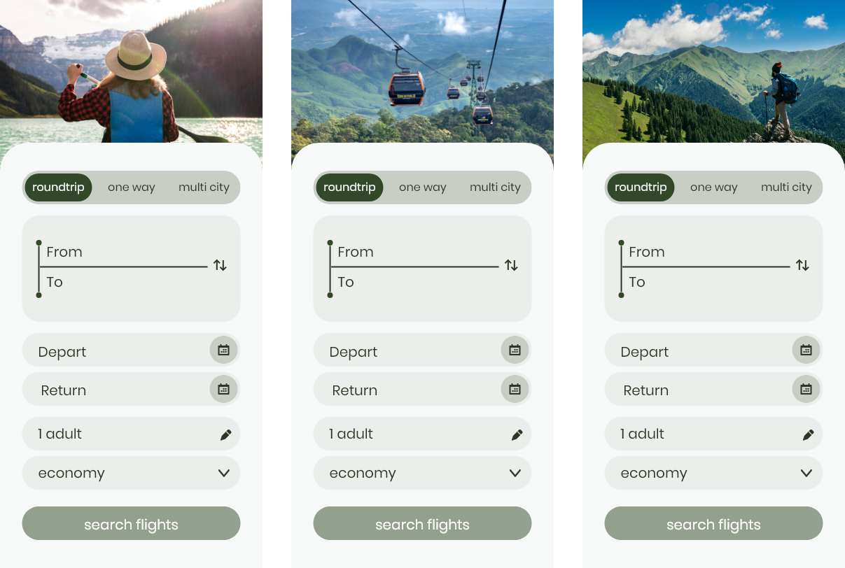
Once the first round of usability tests were complete, I wanted to explore design directions as I transformed the wireframes into a high fidelity prototype. I first created a mood board with two visual design directions; one featured inspiring photography and the other playful illustrations.

Direction 1 | Photography

Rich colors, energetic photography, earthy colors, adventure.

Direction 2 | Illustrations

Playful, friendly, light-hearted illustrations, bright colors.

UI application

I tested both the photography & illustration directions on the flight search form screen while also playing around with colors, typography and other visual styling.

 
Lighter Tan Banner.png

deliver

Yellow green banner thinnest.png

Test, iterate, repeat!

After exploring design directions, I made decisions on the visual styling and implemented improvements from the first usability test report. Then it was back to testing!

Round 2 testing

I recruited participants and tested with them in person. I had them complete the same task of searching for and booking a round trip flight from San Diego to Detroit.

Round 2 testing prototype


I learned a lot with just 3 testers in my second round of testing. I felt this was enough to iterate on my design and make changes to address the most critical issues.

It was interesting that many people found the round trip pricing confusing, even though this is fairly conventional in many flight search apps (cough*Google Flights*cough). However, this means I uncovered a great opportunity to improve upon what exists in the market today.

Just because a product is very successful in the market today doesn’t mean that it has the best design.

Round 3 testing

I iterated on my design again, updating the pricing from round trip to one way pricing to address the primary complaint about the first design.

I also removed the flexible dates menu from the date selection screens. I made this decision because

  • The flexible date menu was confusing to users

  • Flexible date needs could be better addressed by adding pricing to the date selection calendar

  • Nearby dates could still be explored with the date tabs at the top of the search results list

Round 3 testing prototype


Again, usability testing was enlightening. I recruited and tested with 5 people. Two tests were remote, one of which was with an international participant (from the Netherlands).

The use of boxes to separate information (on the expanded flight information card, the trip summary and confirmation screen) really helped users feel confident they had successfully reviewed all the information they needed to; this directly addressed a pain point from the research.

I love how many dates I can see at once and that all the prices are included. It helps me pick a date so much quicker.

 Other positive feedback included:

    • “I like that I can scan through the important stuff really easily.

    • I like that the layover time is included so I don’t have to calculate how long the layover is.”

    • “This trip summary is great. I could even screenshot it really easily.”

    • “It’s clean and easy to see what you need to fill in.”

    • “I like the little boxes and how that makes it easy to scan the information.”

    • “The edit button at the top is great in case I want to quickly change my search.”

However, there’s always room for improvement! I drafted and prioritized another usability test report. If I were to continue iterating on this project, the top issues I would address are below.

Round 3 usability test report


Latest iteration (final prototype)

Lessons Learned

  • Dig deeper into vague adjectives during user interviews

    • Ex: User reports something seems “easier”; dig into what he/she means by the word “easier”?

  • Check accessibility standards (color contrast in particular) earlier in the design process

  • Just because a design pattern or approach is a part of a leading product does not mean it is the best approach

    • Ex: Round trip pricing

References

  1. World Tourism Organization (2019), International Tourism Highlights, 2019 Edition, UNWTO, Madrid, DOI: https://doi.org/10.18111/9789284421152. Page 3.

  2. World Tourism Organization (2019), International Tourism Highlights, 2019 Edition, UNWTO, Madrid, DOI: https://doi.org/10.18111/9789284421152. Page 7.

  3. Staista.com. https://www.statista.com/statistics/278372/revenue-of-commercial-airlines-worldwide/ 

  4. Phocuswright (2019), Air Sales and the Travel Agency Distribution Channel, April 2019. Page 6.

  5. Phocuswright-UserReply (2017), The Perfect Path: What Travelers Want – and Don’t Want – in Their Digital Journey. Page 30.

  6. Expedia Group (2016). Travel Consumer Device Trends, DOI: https://info.advertising.expedia.com/hubfs/Content_Docs/Rebrand-2018/9.7%2003%20Mobile%20PathToPurchase-Small.pdf?hsCtaTracking=6392947a-27be-4ad7-8c1a-4dd9be92f05a%7C6f65d316-5803-4302-b40f-309af173d122. Page 21.

  7. Phocuswright (2017), Phocuswright.com, DOI: https://www.phocuswright.com/Travel-Research/Research-Updates/2017/In-Mobile-Travel-Comfort-Leads-to-Confidence-in-Booking.

  8. SITA (2019), 2025: Air Travel for a Digital Age. Page 6.

  9. SITA (2019), 2025: Air Travel for a Digital Age. Page 6.